- Minimalist Foundation with learning aids
- Component optimization for rapid prototyping
- Intuitive naming conventions
- Accessibility annotations
Loading
Case Study - 2023
Axil Design System Framework

Axil is a lightweight design system framework I created in 2023.
With a focus on usability and rapid prototyping, Axil is a user-friendly starting point for small to medium-sized digital platforms.
My Role
UX Designer & Product Owner
Related Experience
World Wide Technology, Mayo Clinic, & EverBright
The Problem
The goal of a design system is to create a unifying language that is simple enough for any designer to use, yet complex enough to ensure future needs are accounted for.
I’ve worked with many design systems over the years, and I know firsthand how long-term issues can arise from systems that fail to maintain a healthy balance between complexity and adaptability.
Poorly balanced design systems result in:

Poor Adoption

Endless Design Debt

Developer Hesitancy
Experience
I have a long-standing passion for Design Systems and have learned a lot over the years from building and collaborating on them.
Companies that I have personally done Design System work for include:

World Wide Technology
Mayo Clinic

EverBright
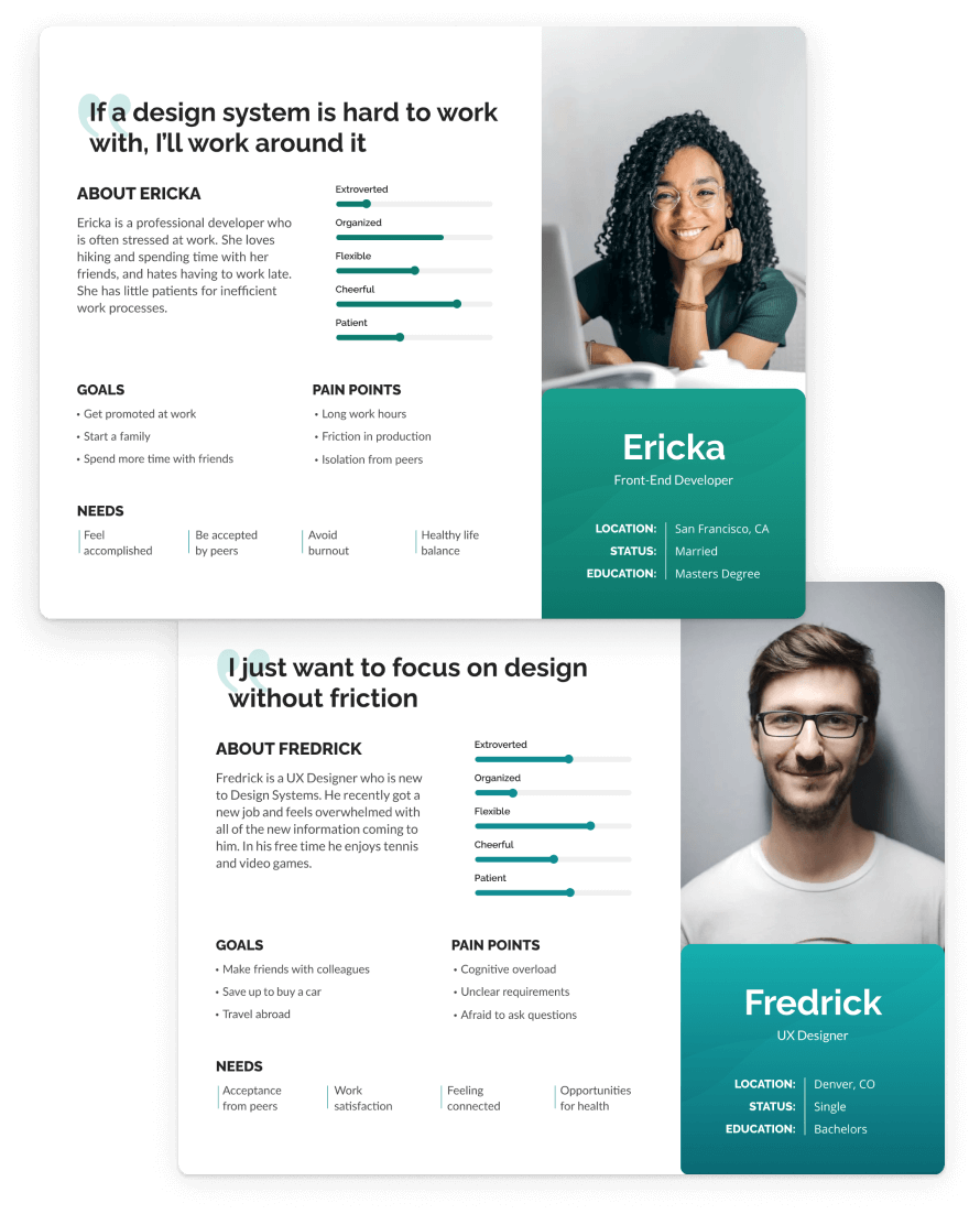
Who is this built for?
I tailored this project specifically for UX Designers and Front-End Developers on small to medium-sized cross-platform teams.
*My Proto-personas are inspired by actual teams I’ve worked with as well as feedback I’ve received over the years.
Research
Internal Data
I utilized research collected over the years to inform the decisions I made on this project. This included:
- Internal UX workshops
- User feedback tracking
- Best practice analysis
- Digital literature review
Learning From the Best
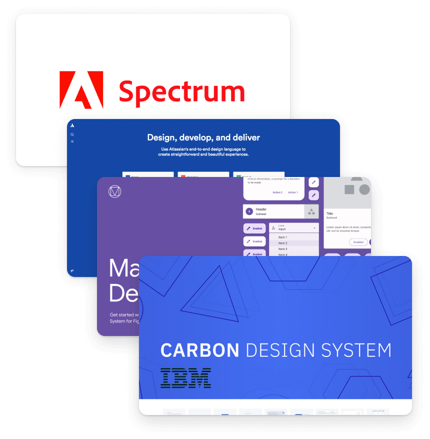
No research is complete without insight into other Design Systems that have been built and withstood the test of time.
Here are some renowned Design Systems that were taken into consideration during my research process.
- Atlassian
- Carbon
- Material Design 3
- Spectrum
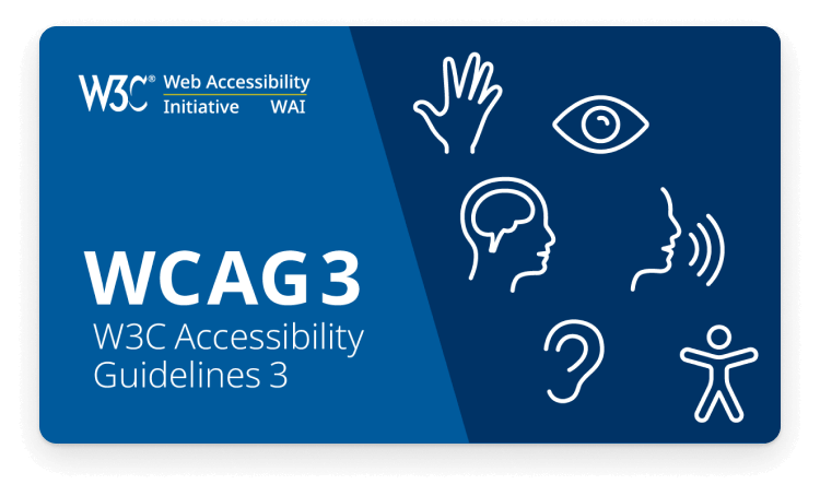
Accessibility-oholic
I couldn’t count the number of times I’ve seen accessibility treated as an afterthought in the design process.
For this project I frequently referenced WCAG3 guidelines to ensure I was addressing as many usability issues upfront as possible.
Key Design Principles
Hick’s Law

Tesler’s Law
Postel’s Law
Introducing Axil
Axil is a simple, yet extensive Design System template for small to medium-sized teams.
With a strong focus on reducing complexity and optimizing accessibility, Axil sets both designers and developers up for success.
Key Features
Usability
Developer Approved
- Clean, automated tokens system
- System for developer feedback
Adaptability
- Maximum future proofing with minimum complexity
- Flexible components that are highly customizable
Learnability
- Beginner-friendly guidelines
- Easy to customize view
- Accessibility tips
- Supportive documentation for implementation
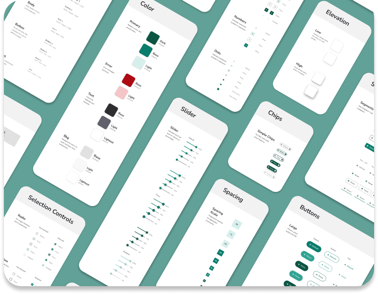
Feature Breakdown
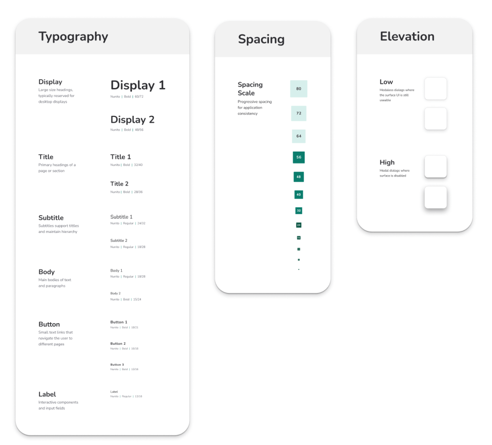
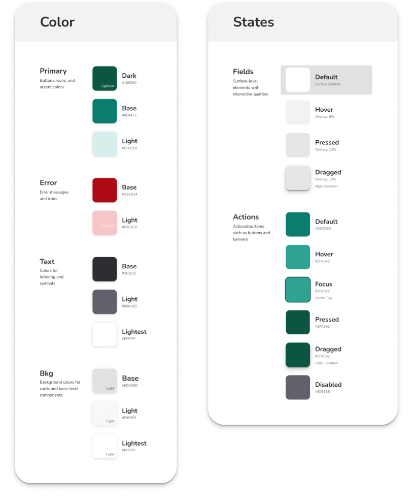
Foundations
I started with a minimalist foundation and a strong focus on usability.
My intent was to set users up for success by minimizing complexity up front and reinforcing what matters the most.
I chose Nunito as my font because it is highly readable and has a friendly appearance.
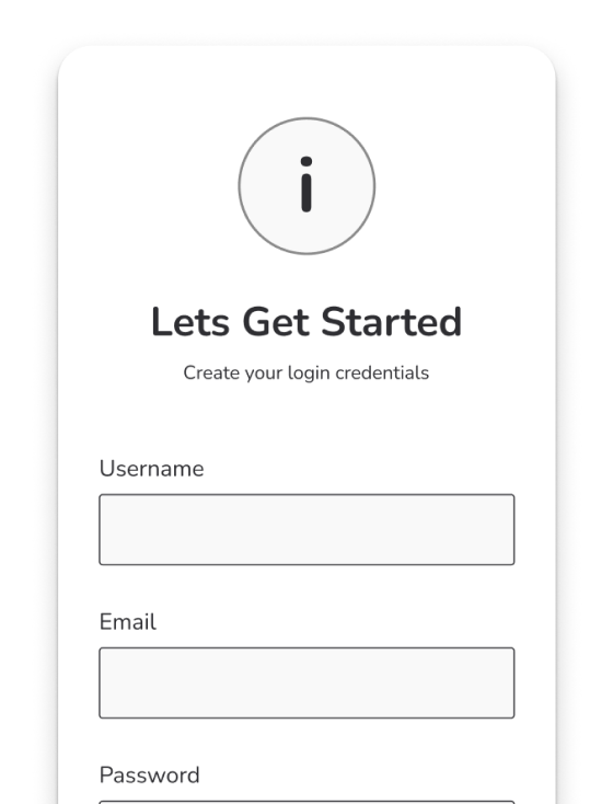
Optimized Components
To support rapid-prototyping and reduce cognitive load, I optimized my components using Figma’s variant system.
I created a single component for each element type (button, slider, chip, etc) and nested all sizes, states, and other custom features as variants.
Future-proofing
To make Axil adaptable, I created separate foundational instances for colors and elements that are commonly subject to change.
I then went in and optimized each of my components so that it could be easily customized and changed. This made the system adaptable while presenting as little complexity up front as possible.
Wireframe Mode
To add efficiency to the design process, I provided a “wireframe” version for each of my components.
This trick allowed designers to quickly build wireframes without having to seek out additional libraries. It also helped designers to quickly jump between the wire-framing and high-fi stages of design.
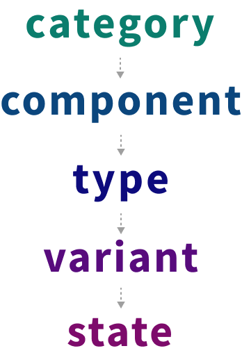
Naming Conventions
I named and organized my components using Order of Operations logic.
To keep this simple and ease the translation of components to tokens, I used lower case for all component names.
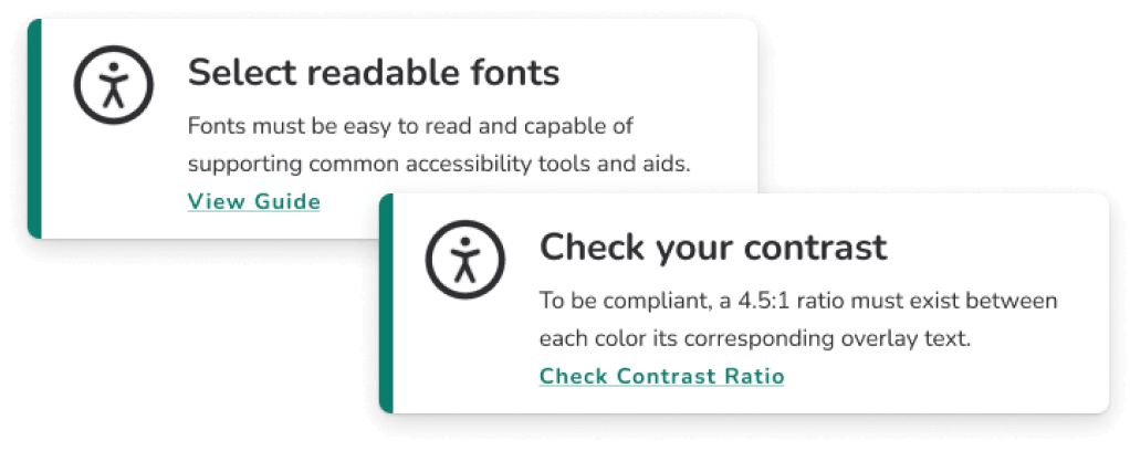
Accessibility
Throughout Axil I included accessibility notes with links to external documents.
I added these to help train new users and reinforce the importance of accessibility.
Basic documentation
I included basic documentation for design system use and token implementation.
I added these to help train new users and reinforce the importance of accessibility.
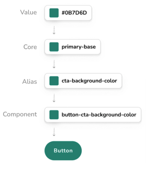
Token System
I included documentation for token creation and implementation using the Figma Tokens plugin.
This gave users a brief introduction to tokens with a step-by-step breakdown of how to install the plugin and begin implementation.
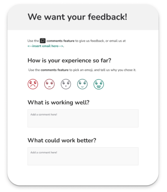
Feedback is Golden
Developer feedback is paramount to a successful implementation.
I included a feedback system with friendly instructions that encouraged developers and other stakeholders to leave feedback.
Conclusion
Axil was both a fun and challenging project for me. I enjoyed applying the skills I’ve gained over time working with Design Systems to build what I thought was the best starting point for a small to medium-sized design team.
I believe Axil is a useful tool that will help teams build design systems quickly and effectively when implemented.