- Ability to search by insurance provider was not clear
- Ability to search by location or zip code was not clear
- Initial results were dependent on user’s location permissions and often showed irrelevant results
- Data filter issues existed in results
Loading
Case Study - 2021
A Better Search Experience
In 2021, I worked with a healthcare application that allows patients to book appointments with physicians in their area.
I did a research project to identify critical problems in the user experience and created an informed, updated design.
My Role
UX Research & Design
Company
World Wide Technology
Design Note
To help keep World Wide Technology clients anonymous, I reskinned my designs and removed all branding and competitive feature indicators for this project.
The Problem
Interest in this project began when our Analytics Team discovered an unusually high drop-off rate with users on the app’s provider search feature.
Following an internal audit, my team identified several critical issues with the feature:
Research
The purpose of my initial research was to identify critical areas within the provider search feature that caused friction for our users.
Unmoderated User Study
Using the platform UserZoom, I created an unmoderated user study that asked users to talk out loud while performing the following three tasks:
- Locate a primary care physician that is currently accepting new patients
- Locate a dermatologist in the city of Phoenix, AZ
- Locate a neurologist that accepts Kaiser Permanente insurance
Afterwards they were provided with a survey to help me identify user priorities and behaviors.
Results
The study provided valuable data on how users interacted with the application as well as where they were getting frustrated when attempting to narrow search criteria.
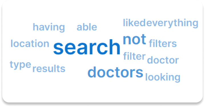
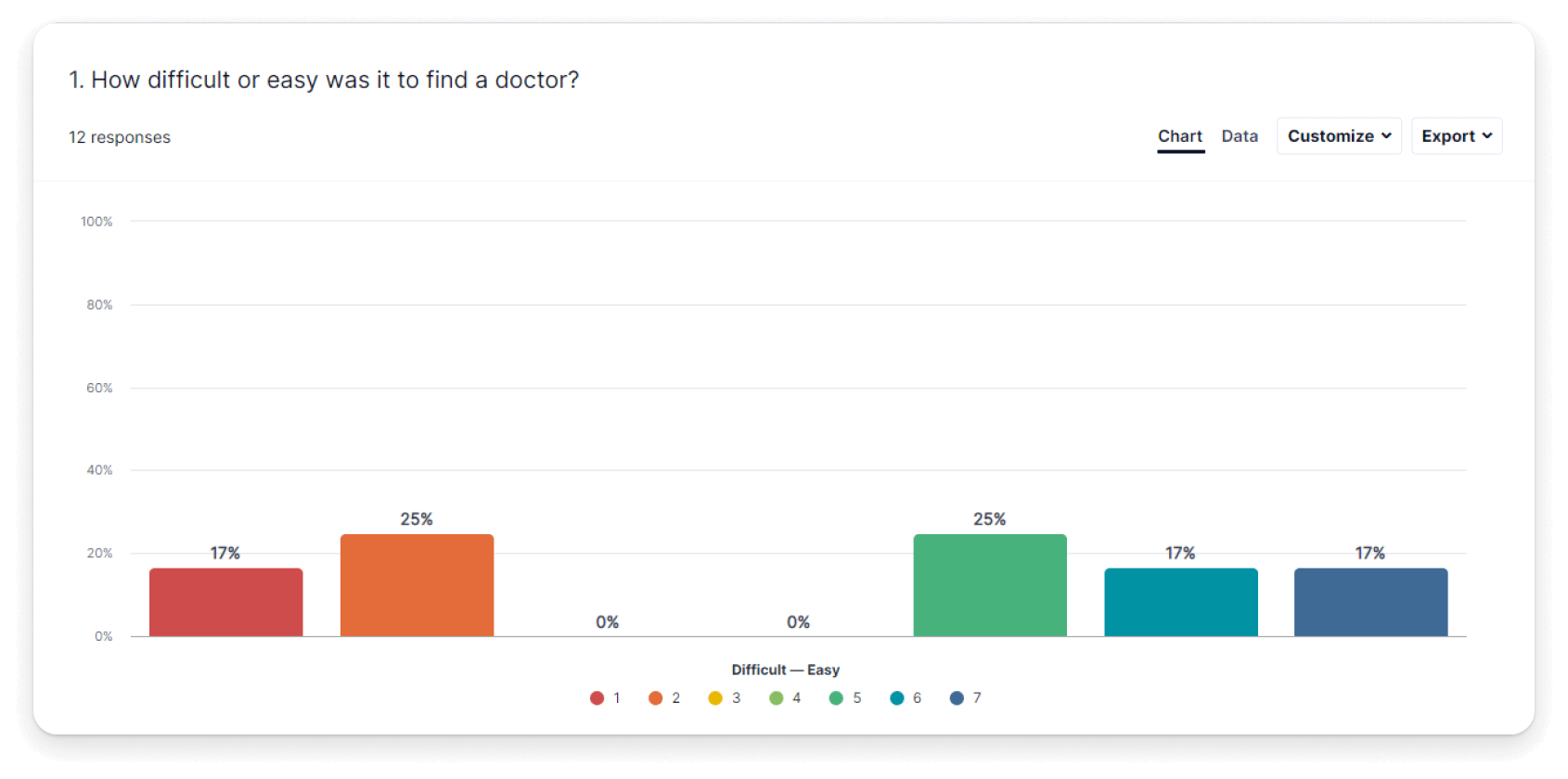
In general, users struggled with tasks that required more than one search criteria. This was especially true in the third task, where in many cases the application failed to show any insurance information.
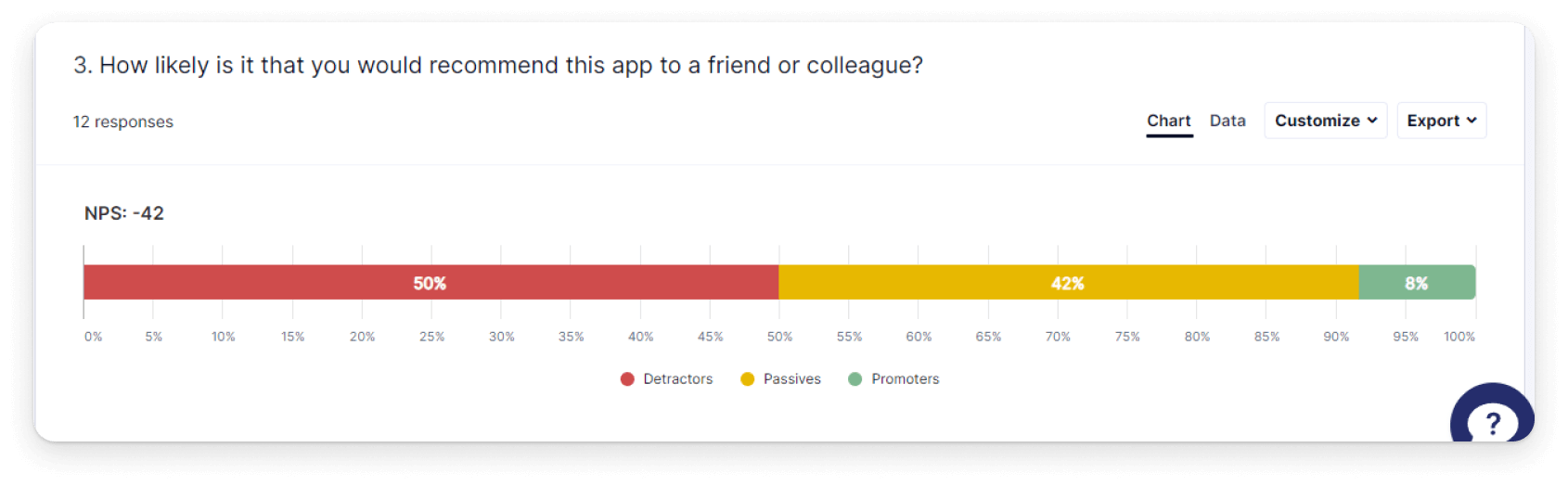
After completing the three tasks, most users has an overall negative view of the feature. The image above illustrates this point. When asked if users would recommend the My Care app to a friend, 50% specifically said no, 42% were neutral, and only 8% said yes.
Analysis
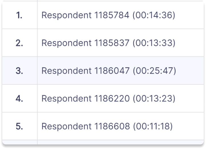
Using the video data collected from the study respondents, I was able to map commonly observed behavior and identify additional issues in the search experience.
Key Take-Aways
Spelling issues are a roadblock for some users
- In the second task, 41.67% of users had issues with spelling and had to re-enter search terms one or more times.
- In the third task, 33.33% of users had issues with spelling and had to re-enter search terms one or more times
- Several users anticipated an auto-fill feature and just entered in the first letter of their search criteria
The search tool does not provide a good user experience
- Only 8% of users said they did not encounter any problems while completing tasks
- Verbal frustration was observed in 75% of all users
- Only 8% of users said they would recommend this app to a friend. 50% specifically said they would not.
Users expect filters as part of their experience
- Users specifically mentioned wanting to see more filter options a total of 15 times
- Users specifically expressed a desire to see filters for location, provider type, and insurance
Finding in-network providers is difficult
- 50% of users reported being confused by how to search by insurance provider
- In recordings, users specifically mentioned they would like to see insurance listed on provider cards.
Search inconsistencies are a problem
- Users reported issues with results not matching their search terms
- Searching by state did not consistently work
- In the final questionnaire, 58% of users reported being confused by location search


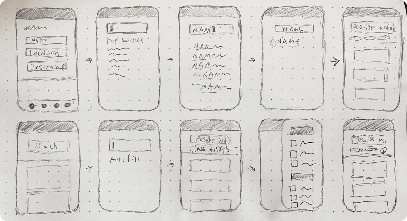
Initial Sketches
After building user flows, I kicked-off the UI design process by quickly sketching potential layouts and solutions.
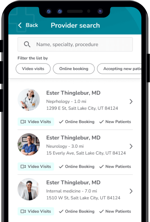
Wireframes
Next I created wireframes which I used to consult stakeholders and our development team.
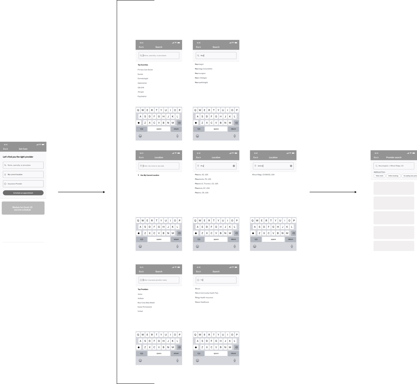
Iterations
The wireframes went through several iterations before high-fidelity mockups were made.
Usability test
Using UserZoom as a platform, I conducted a basic usability test on the high-fidelity wireframes to ensure the design was effective.
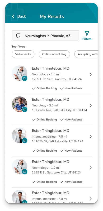
Final Design
After multiple iterations, I created a final design and prepared for implementation.
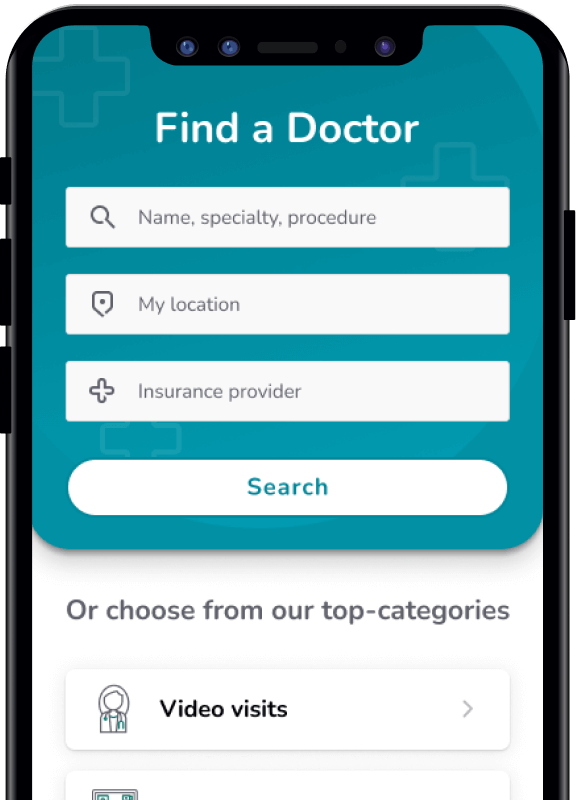
Key Features
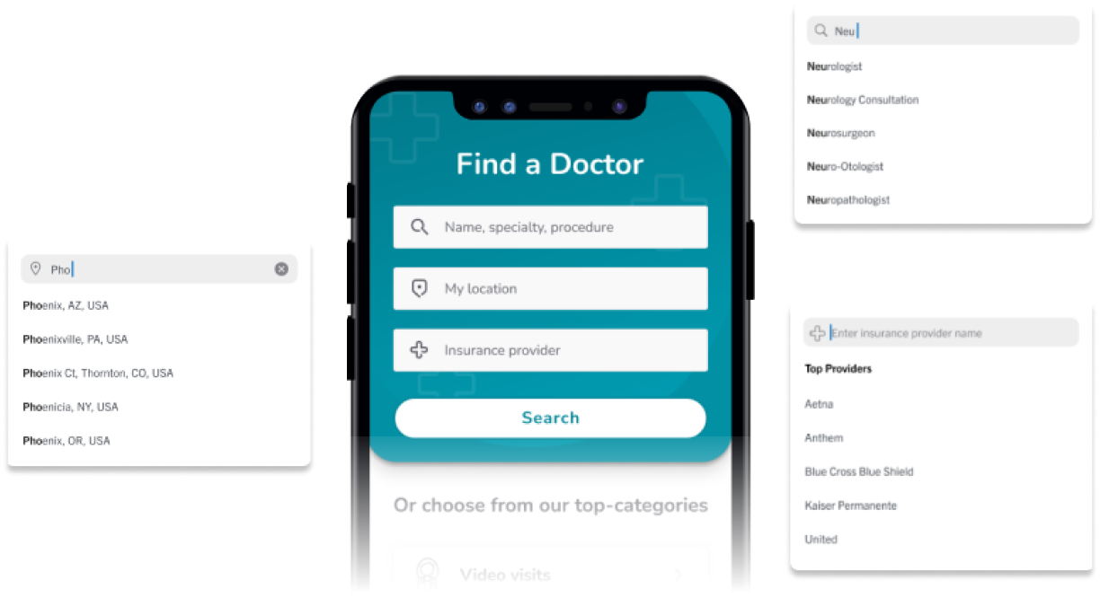
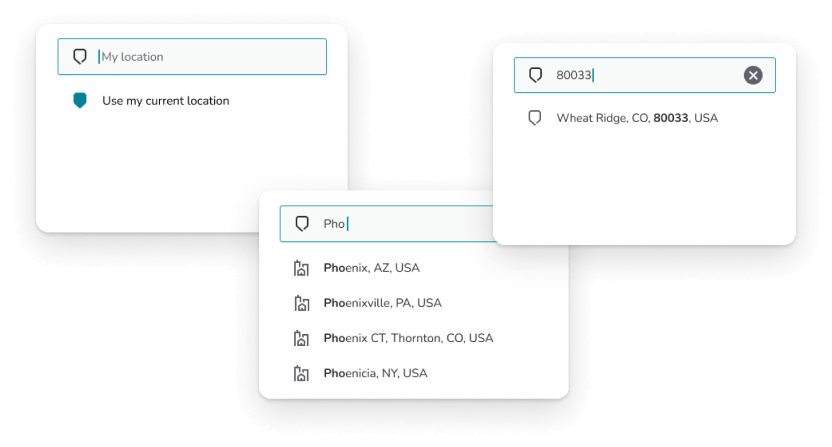
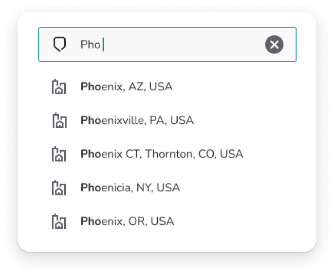
Auto-fill feature
To reduce typos and spelling errors I added an auto-fill feature. This also acted as an assist for users to assure they only picked valid data points.
Eliminating Ambiguity
I broke the single search approach into three separate bars, each highlighting one of the search parameters available to the user.
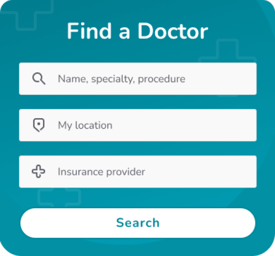
Intentional Constraints
Rather than allowing users to search by any term, users now have to select from a list of valid data points before they can move to the next step. This not only reduces errors, but makes searches with typos and misspellings impossible.
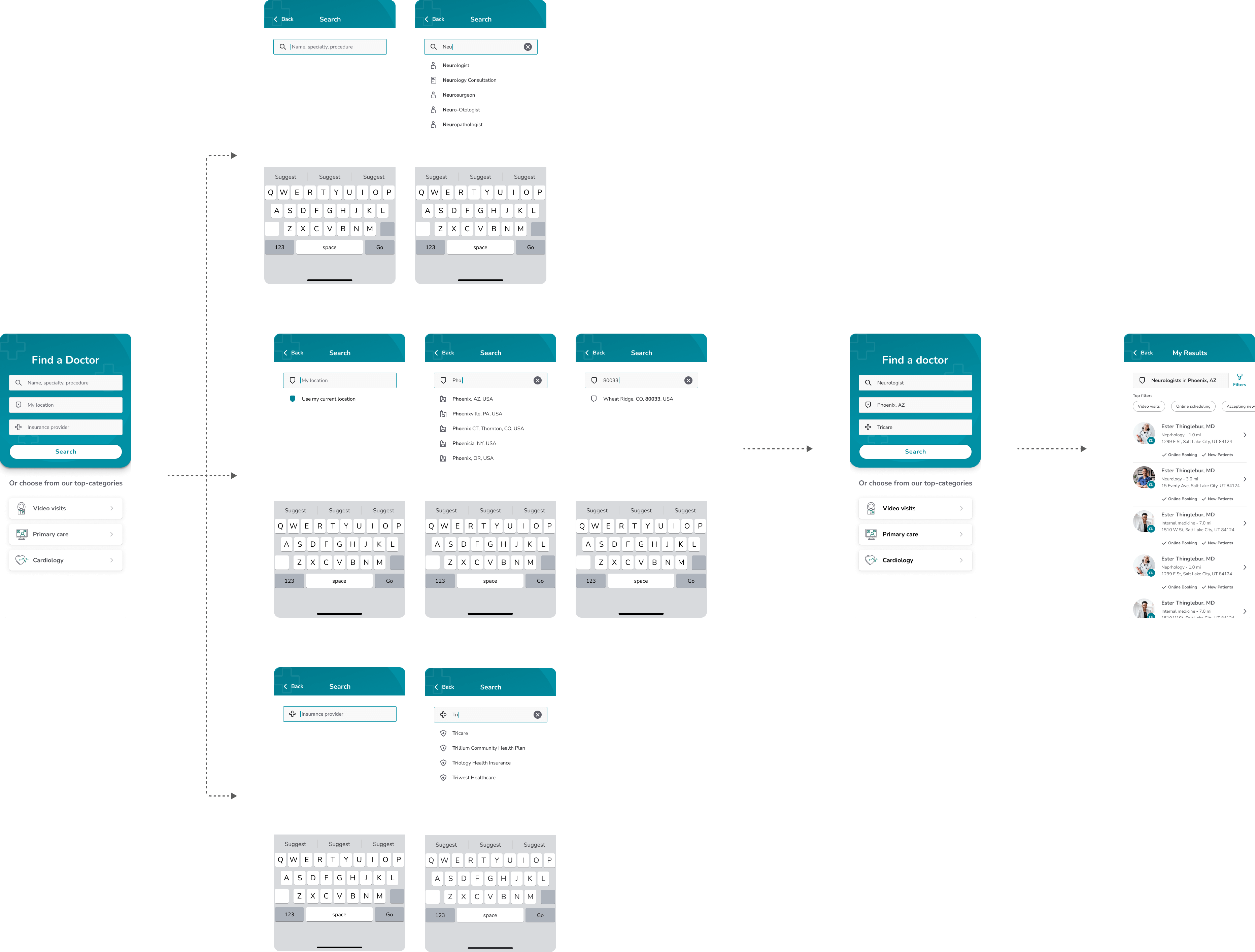
Final Flow
Below is the final design flow which I presented to our dev team along with development guidelines.
Conclusion
This was a fun project for me to work on and I was happy for the opportunity to advocate for a better user experience.
While our contract with the client ended before we got the chance to measure the impact of our improvements, I left confident that we had done our best to make using the provider search feature a seamless and beneficial experience.