- Billing payment, contract access, and contact support accounted for most app use
- Interaction with system controls was minimal
- Non-interactive items were being tapped on frequently
Loading
To set EverBright up for success I needed a comprehensive understanding of our users and the greater solar homeowner service field.
Getting a budget for research was a challenge when I started. I leaned heavily on best practices in the field and leveraged my network for qualitative data to tackle that obstacle.
My Role
Lead Product Designer
Company
EverBright
Research Goals
- Gain a comprehensive understanding of our competitors and common use cases within the field
- Gain an understanding of user pain points, motivators, and needs
- Analyze current state of mobile app and look for improvements
- Gain insights on sustainable design patterns
Limitations
- Research budget under $500
- Limited team capacity
- Short timelines
- No access to users
- Minimal analytics integration
My Solution
Initial research consisted of 6 studies completed over the course of 3 weeks.

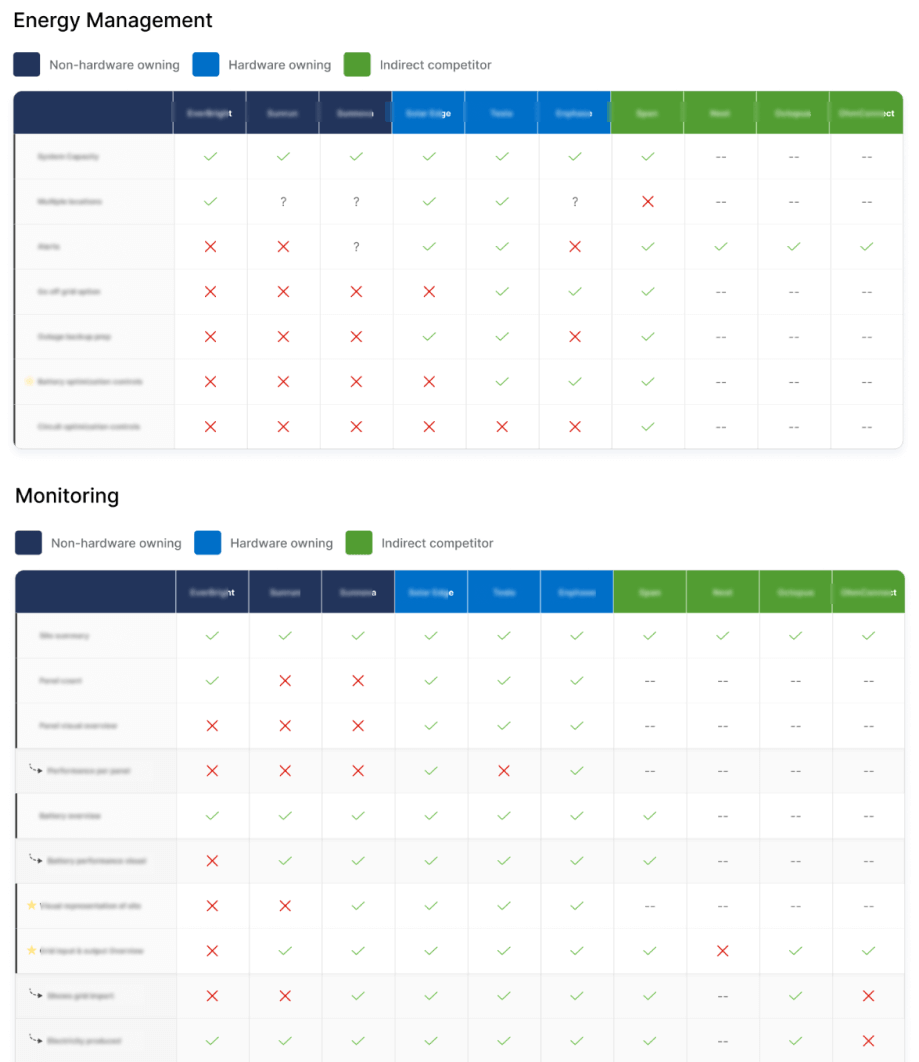
Competitive Analysis
In-depth analysis of 9 competitors & 47 features

Heuristics Evaluation
Analysis of existing usability & accessibility issues

Heatmap Analysis
Analysis of in-app user behavior & key interaction points

Card Sort Study
Information Architecture study with internal users

UX Trends Study
Sustainable design trends discovery & analysis

Contextual Inquires
Series of 6 interviews & analysis of themes
Competitive Analysis
To kick off the research phase, I completed a competitive analysis that consisted of:
- 9 competitors
- 6 feature categories
- 47 features
This gave me a dynamic view of our competitors, their core areas of focus, and how they were solving similar problems to ours.
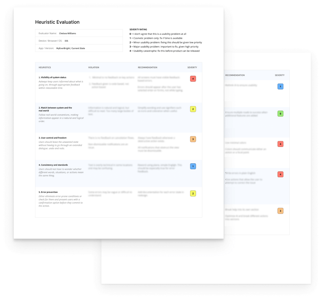
Heuristics Evaluation
I conducted an initial heuristic evaluation and identified the following issues:
- Usability issues
- Accessibility issues
- Issue prioritization & severity
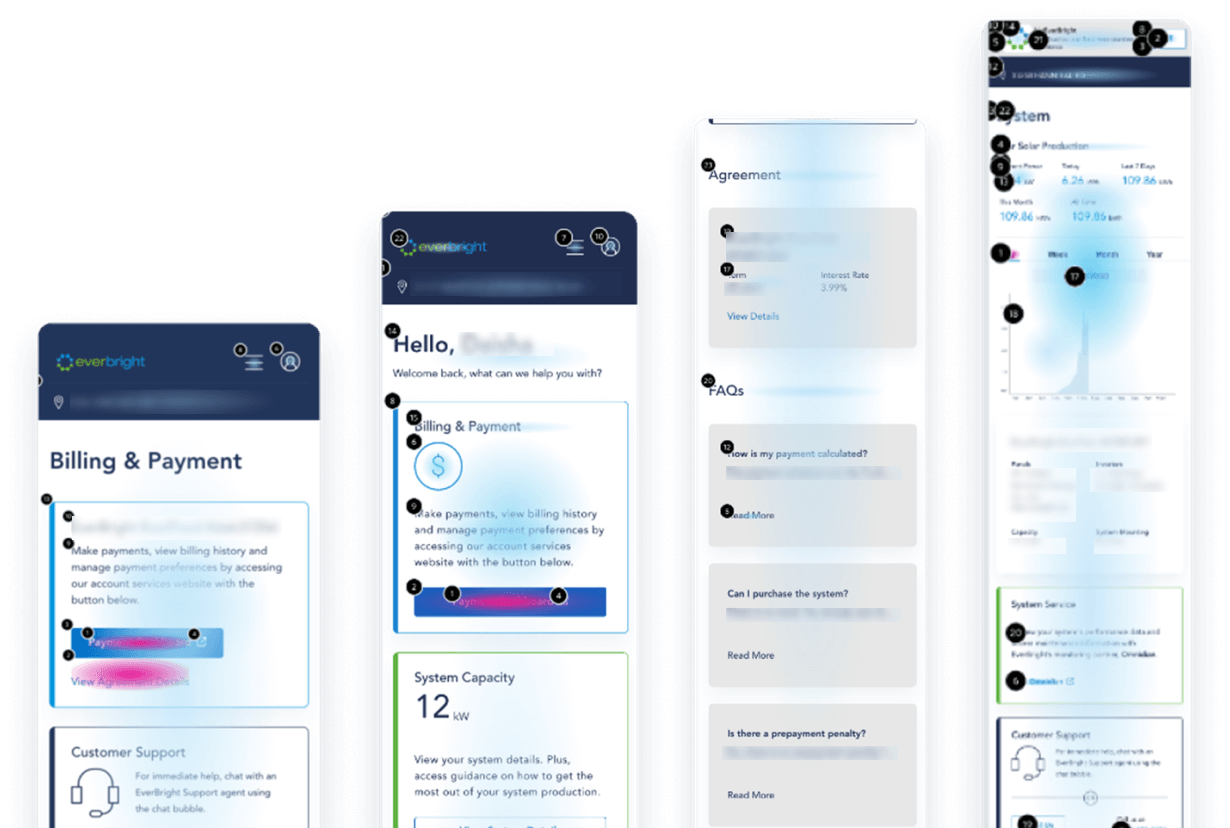
Heatmap Analysis
My team and I conducted a heat-map analysis to glean insight into user behavior and identify key interaction points and usability issues. We learned:
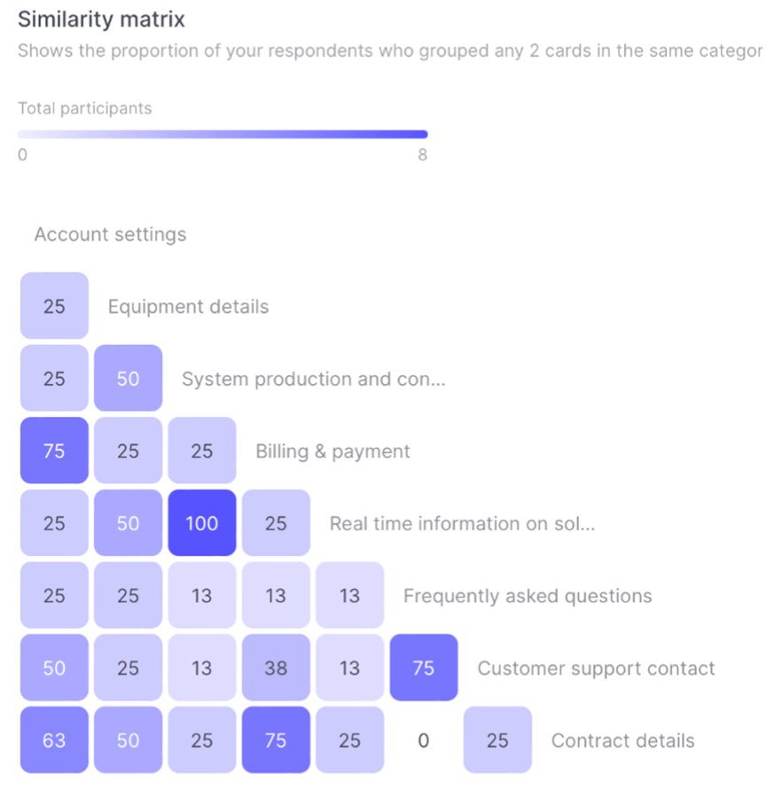
Card Sort Study
To help optimize information architecture in the app, my team and I conducted a card sort study using UseBerry.
While the data set was small, we were able to:
- Identify patterns in user navigational expectations
- Identify key items with high similarity between participants
- Use the information gleaned to improve the information hierarchy of the MyEverBright app
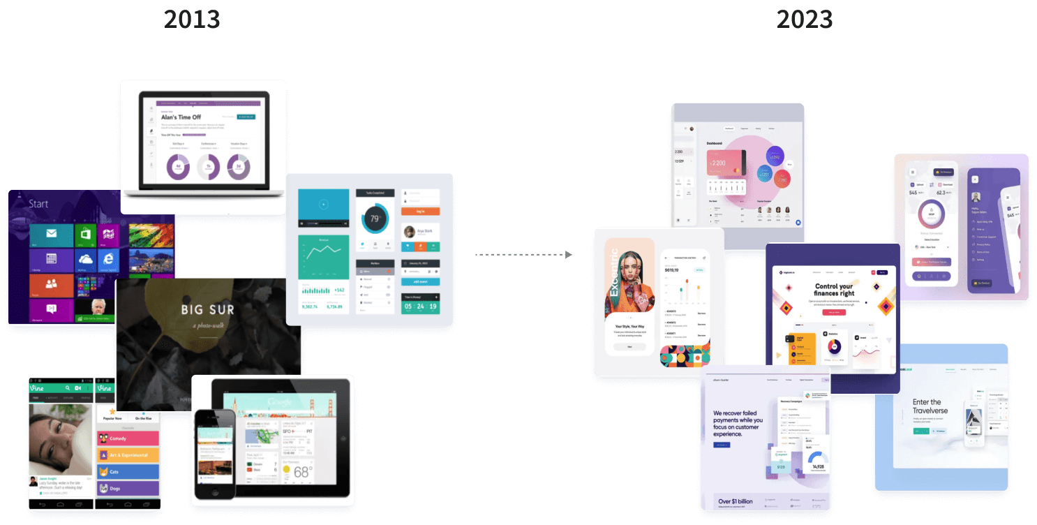
Design Trends Analysis
Lack of access to our users was a challenge for me when defining our visual language. I couldn’t safely make assumptions about our user demographic without data, so I opted for a more conservative visual aesthetic.
The purpose of this analysis was to filter out short-term design trends and identify more sustainable patterns that can stand the test of time.
Some of the insights I gained were:
- Material.io & Apple Design withstood the test of time as leaders in design practices
- Accessibility is paramount to design longevity
- Inclusivity has played a key role in design evolution over the years
- Minimalism is on the rise. Layouts have gotten simpler over time
- Curved edges and soft organic shapes have remained popular since their first use
- User-centered patterns tend to flucuate the least with design trends
Contextual Inquires
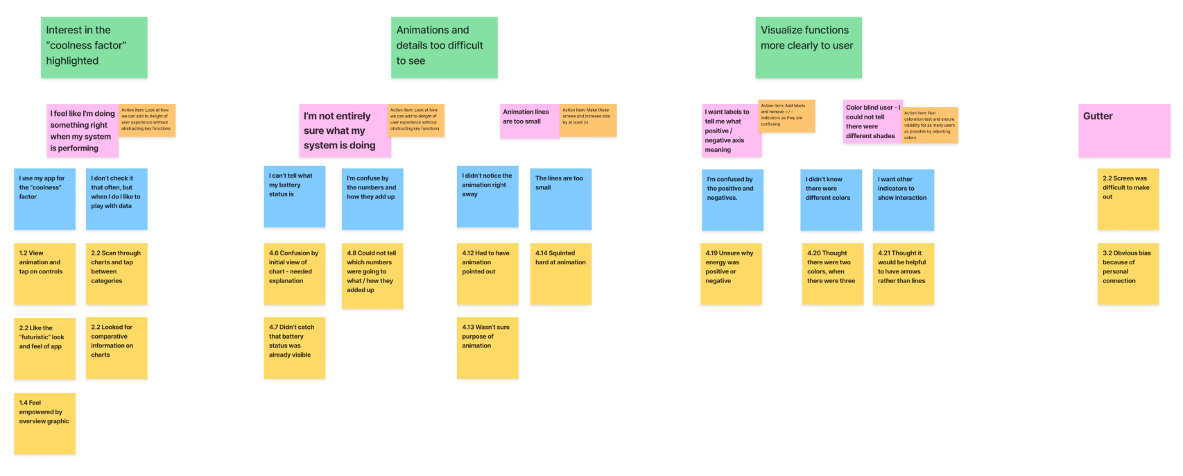
To work around our poor real-user access, I tapped my personal network of homeowners with solar panel systems and conducted a series of 6 interviews.
For each interview I asked my participants a series of 8 questions, and had them walk me through a typical session with their digital home-owner portal.
I consolidated the notes from these interviews and organized them by theme to identify patterns and action items.
Key Research Insights
Low Use
Users typically used the app once or twice, then never again.
Poor User Experience
Application was not optimized for mobile devices and did not follow best practices.
Poor Accessibility
Application was not WCAG 2.0 compliant and lacked key usability features.
Negative Feedback
App score was low, and negative feedback centered on login and billing experience.
Behind Competition
Application was far behind our competitors in providing our users with value.
Difficult to Navigate
Users were getting lost in the app when looking for key features.
Patterns Among Competition
Competitors have been solving similar problems and share common design patterns.
Homeowners Want More
Education, curiosity, and enjoyment were key motivators for homeowners engaging in similar apps to ours.
Application
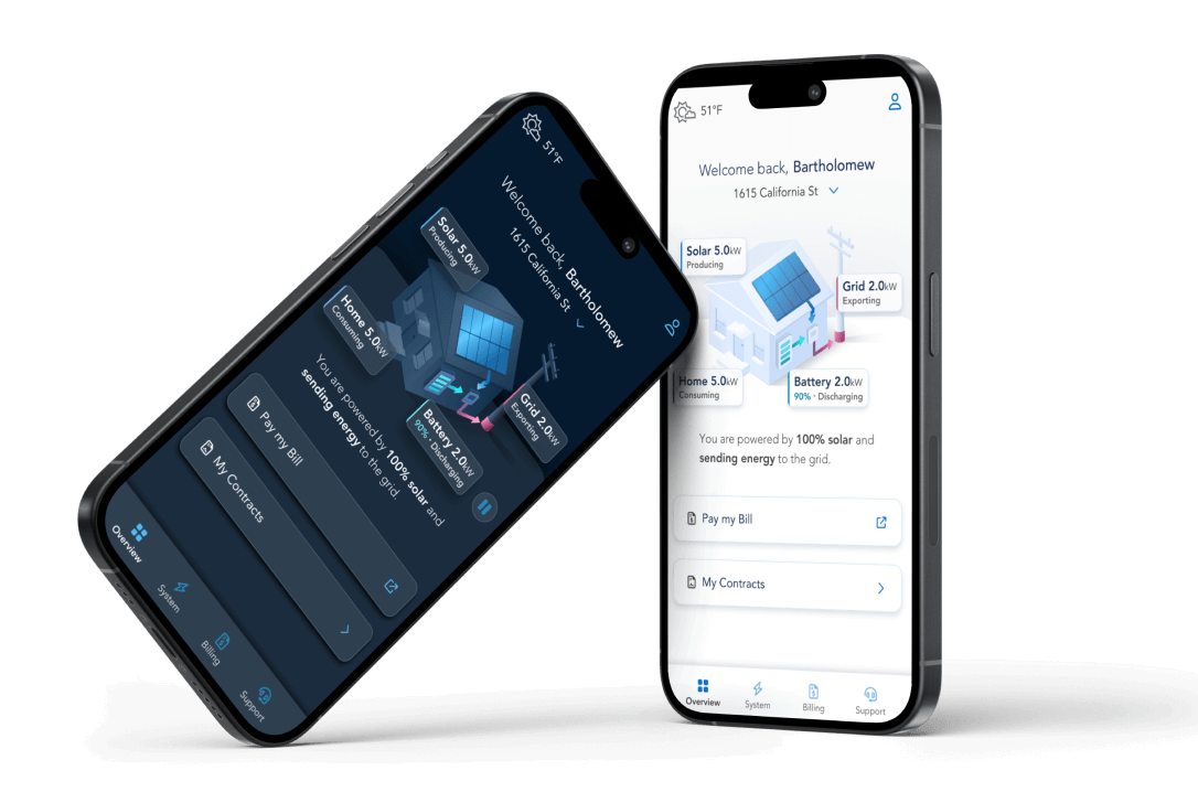
Research played a vital role in my design process and I used it in all stages of the MyEverBright redesign, including:
- Visual Language Identification
- Complete app redesign
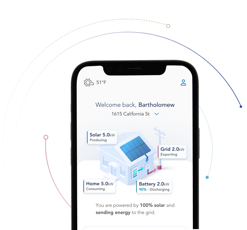
- Real time power flow feature
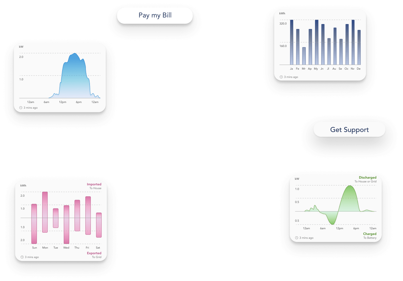
- Data monitoring charts feature