Case Study - 2024
Creating a Visual Language
EverBright needed a modern design direction for their MyEverBright application to establish professionalism and earn brand trust.
My goal was to create a visual language that was inclusive and highly usable, while staying true to the EverBright Brand.
My Role
Lead Product Designer
Company
EverBright
Goals
- Create a modern visual language that sets us apart from our competitors and emboldens brand identity
- Utilize accessible and inclusive design practices to minimize cognitive load and set team up for success
- Minimize risk for future design work and maximize growth potential for our business
Limitations
- Very small research budget
- Almost no access to users
- Brand limitations
- Short timelines
Process Overview
My role in this project was to lead a small team of designers and establish EverBright’s visual language for the MyEverBright Application redesign.
My process consisted of:
- Product definition & stakeholder meetings
- Internal design team ideation workshop
- Multiple iterations with stakeholders
- Internal feedback sessions with all involved teams and leads
- Finalization & documentation
Product Definition
After my initial kickoff meeting with leadership, I facilitated meetings with all stakeholders to ensure I understood:
- Scope of project
- Business objectives
- Available research tools
- Branding limitations
- Technical constraints
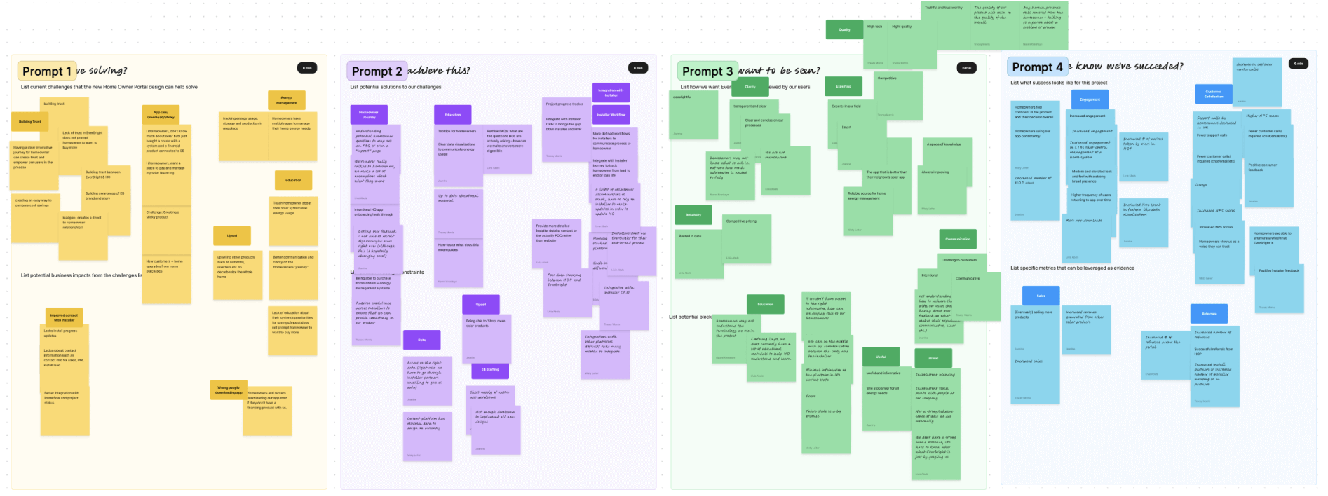
Ideation Workshop
I facilitated an ideation workshop with our internal design team, consisting of 8 product designers of various levels and backgrounds.
The purpose of this was to build a deep understanding of brand and brainstorm mood and themes as a team. I used this, along with research, to set the groundwork for our new visual language.
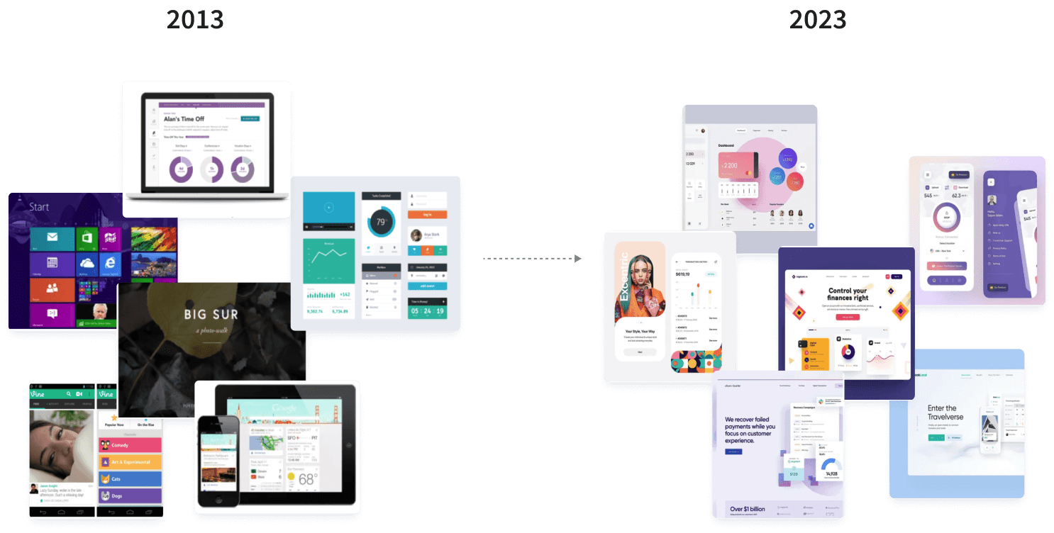
Design Trends Analysis
Lack of access to our users was a challenge for me when defining our visual language. I couldn’t safely make assumptions about our user demographic without data, so I opted for a more conservative visual aesthetic.
The purpose of this analysis was to filter out short-term design trends and identify more sustainable patterns that can stand the test of time.
Some of the insights I gained were:
- Material.io & Apple Design withstood the test of time as leaders in design practices
- Accessibility is paramount to design longevity
- Inclusivity has played a key role in design evolution over the years
- Minimalism is on the rise. Layouts have gotten simpler over time
- Curved edges and soft organic shapes have remained popular since their first use
- User-centered patterns tend to flucuate the least with design trends
Key Features
Once I had the information I needed, I identified the key features that aligned with our business goals.
The purpose of this was to outline our priorities and ensure we were starting with the right mindset before digging into aesthetics.
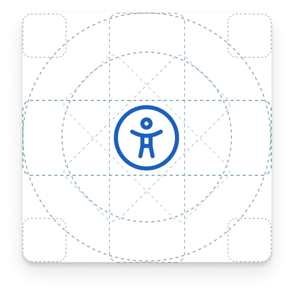
Accessibility-First Design
Accessibility and Inclusivity were paramount to the success of this project.
To ensure accessibility, I did the following:
- Periodically reviewed WCAG standards
- Gave team presentation on Inclusive Design
- Set the groundwork for accessibility audits for future work
Minimalism
In the absence of user data, I was confident that minimalism was the best route for ensuring usability and positive reception.
I also chose this direction to:
- Reduce as much complexity as possible up front
- Minimize visual clutter to ease cognitive load
- Set groundwork for upcoming features with interactive features
Action-Oriented Color Use
To ensure user attention was only being drawn to key information, I removed color from everything that didn’t pertain to a key user action or focal point.
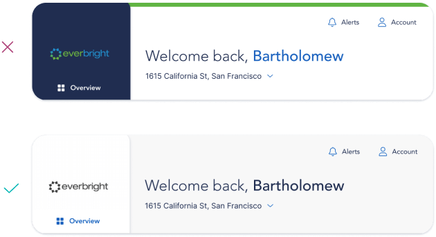
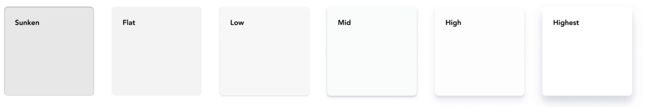
Elevation & Depth
I used drop shadows and coloration to enhance visual hierarchy while mimicking patterns that appear natural to the human eye.
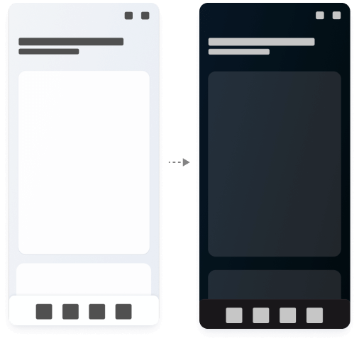
Light & Dark Modes
I created a one-to-one light to dark system and exported the file to JSON to minimize scope-creep. The purpose of this was:
- Improve usability and control
- Enhance user engagement by supporting theme preferences
- Set team up for success by addressing a common design request early
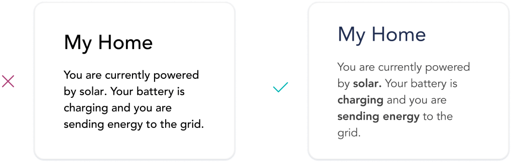
Text Optmization
While the font family remained the same as branding, font-weight was updated to improve scannability and visibility of key terms and phrases.
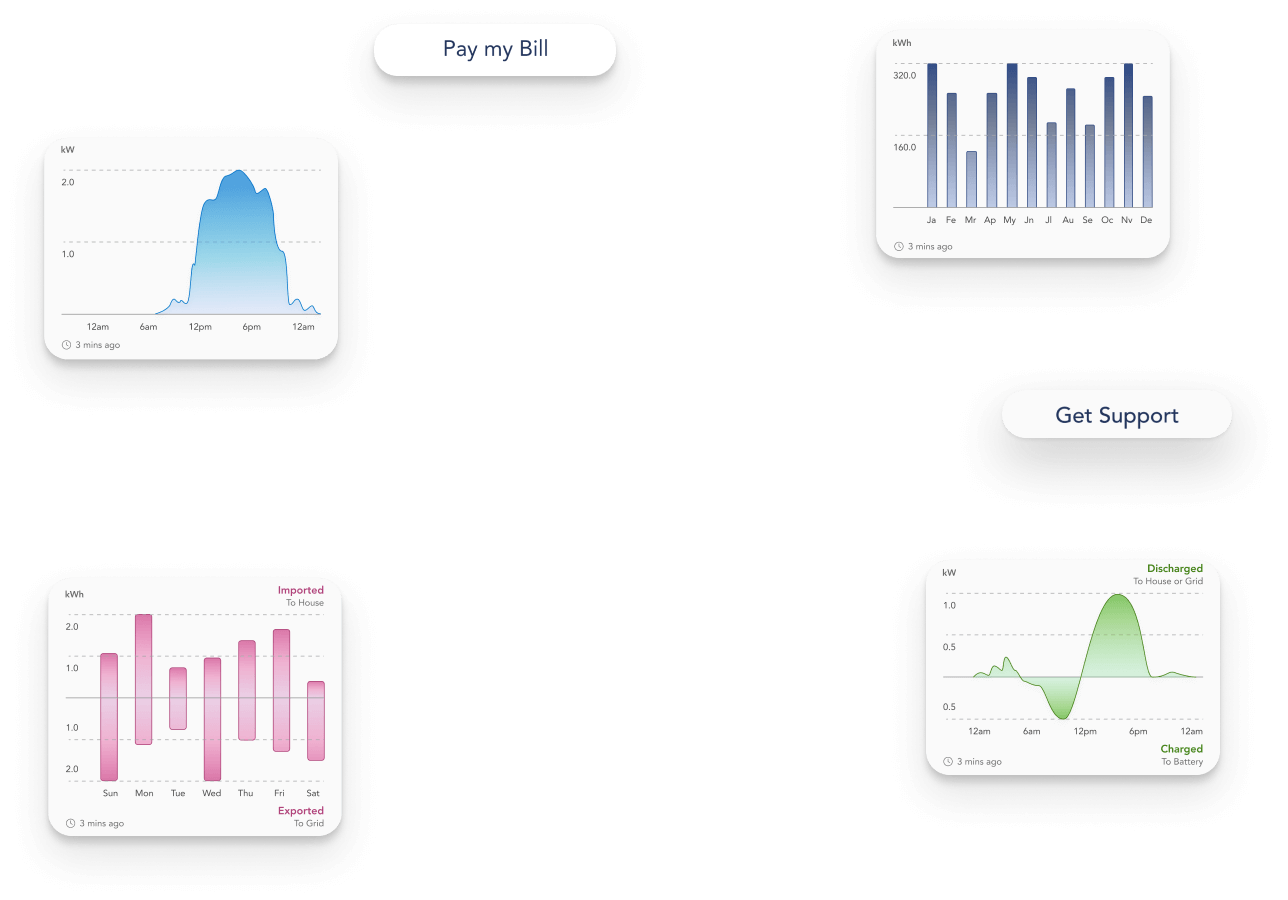
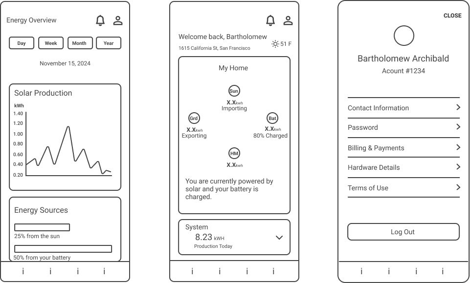
Wireframes & Exploration
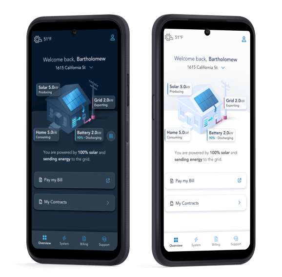
To visualize our future design state, I created a series of early-concept wireframes that visualized our upcoming real time power flow and enhanced system charts features.
This gave my team a framework to brainstorm and iterate on, while also setting the stage for future work.
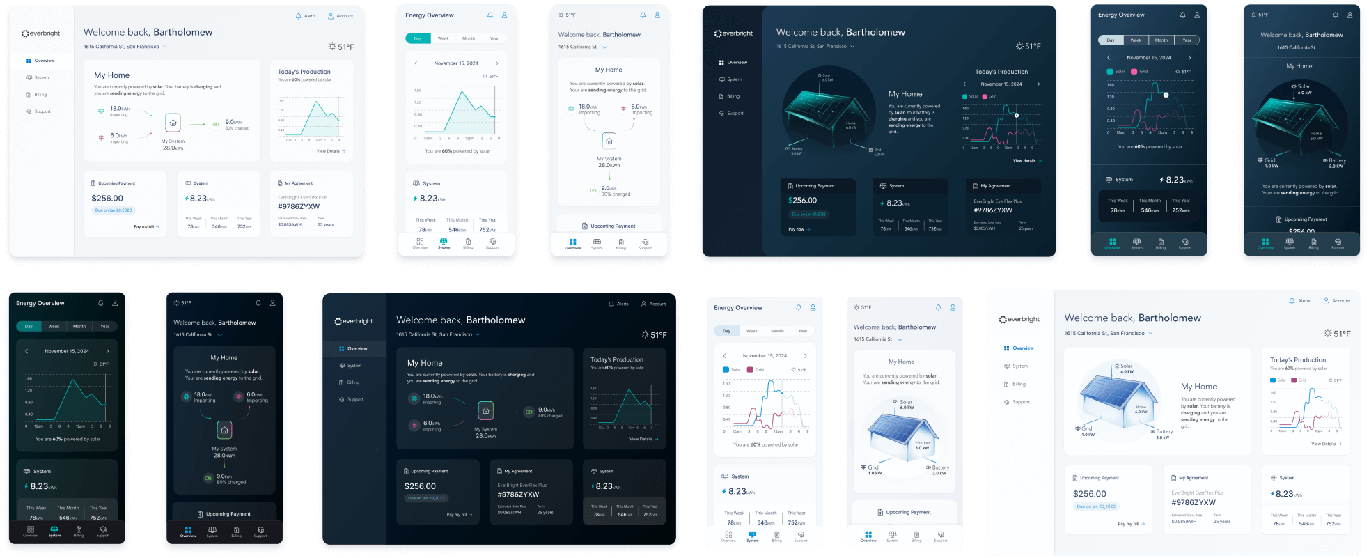
Early Iterations
For the first iteration, we worked closely with our leadership team to identify our general direction.
Following iterations focused on overall look-and-feel. For these I facilitated design reviews with our leadership, marketing, development, and greater design teams.
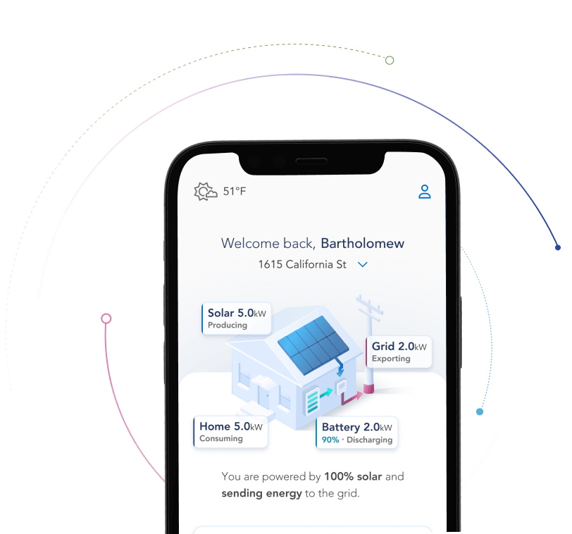
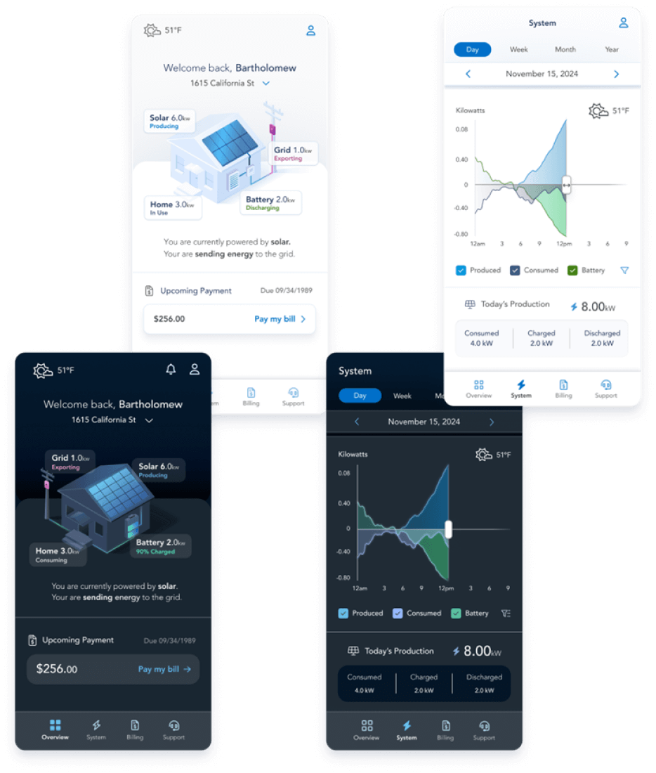
Final direction
After our final iteration, I went through a series of sign-offs with our leadership, marketing, and greater design team.
With our final direction identified, I was able to:
- Kickoff the full app redesign phase
- Set the stage for rapid prototyping & development
- Set stakeholder expectations
- Identify early design & development constraints
Application
With a new visual language defined, my team and I were able to jump into redesign work with minimal roadblocks.
This language was used throughout the MyEverBright mobile and eventual web redesign.
Back to Main Case Study