Case Study - 2024
Real-Time Power Flow
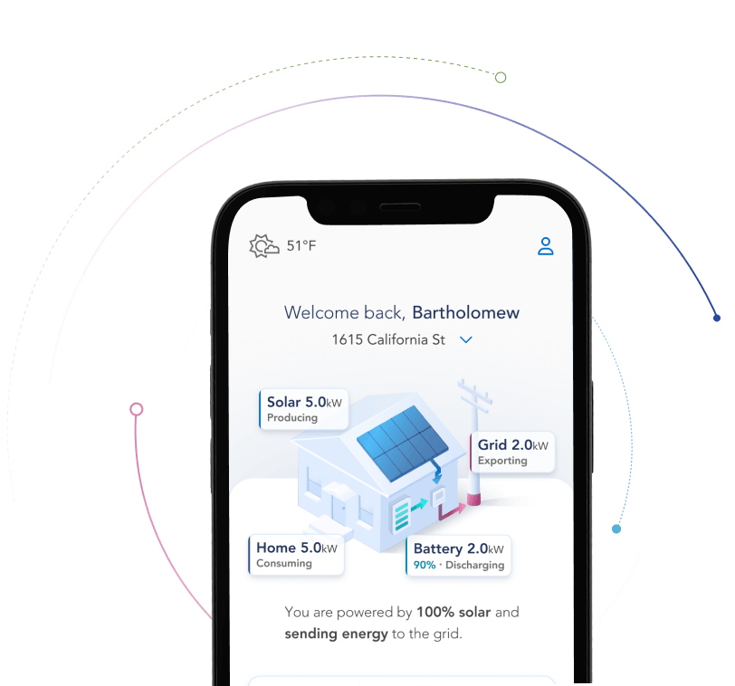
We needed to give EverBright’s users a fully comprehensive, live view of their system that could outshine our competitors.
To achieve this, I built a highly user-focused solution that balanced ease of use with modern aesthetics.
My Role
Lead Product Designer
Company
EverBright
The Problem
Before the full MyEverBright redesign, most of our users were only using our app once or twice before disengaging.
We needed a solution that would improve engagement and trust, while also empowering users to optimize their energy systems and reduce carbon emissions.
My Role
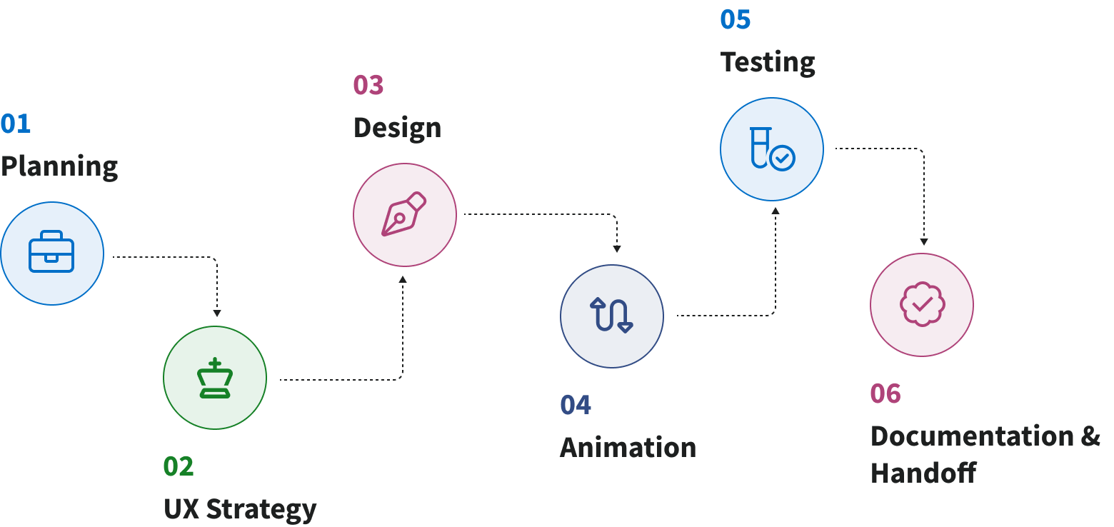
I had the pleasure of taking this project from start to finish. I was responsible for all planning, strategy, UX / UI design, animation design, testing, documentation, and handoff.
Related Research
To kickoff this project, I leveraged research that had been completed as part of the redesign as a whole.

Competitive Analysis
In-depth analysis of 9 competitors & 47 features

Heatmap Analysis
Analysis of in-app user behavior & key interaction points

Contextual Inquires
Series of 6 interviews & analysis of themes
Initial Sketches & Wireframes
I went through several iterations of initial concept drawings to visualize various solutions to the problem.
Next, I translated three options into wireframes. These were reviewed by leadership to confirm direction, then reviewed by our engineers to identify technical constraints.
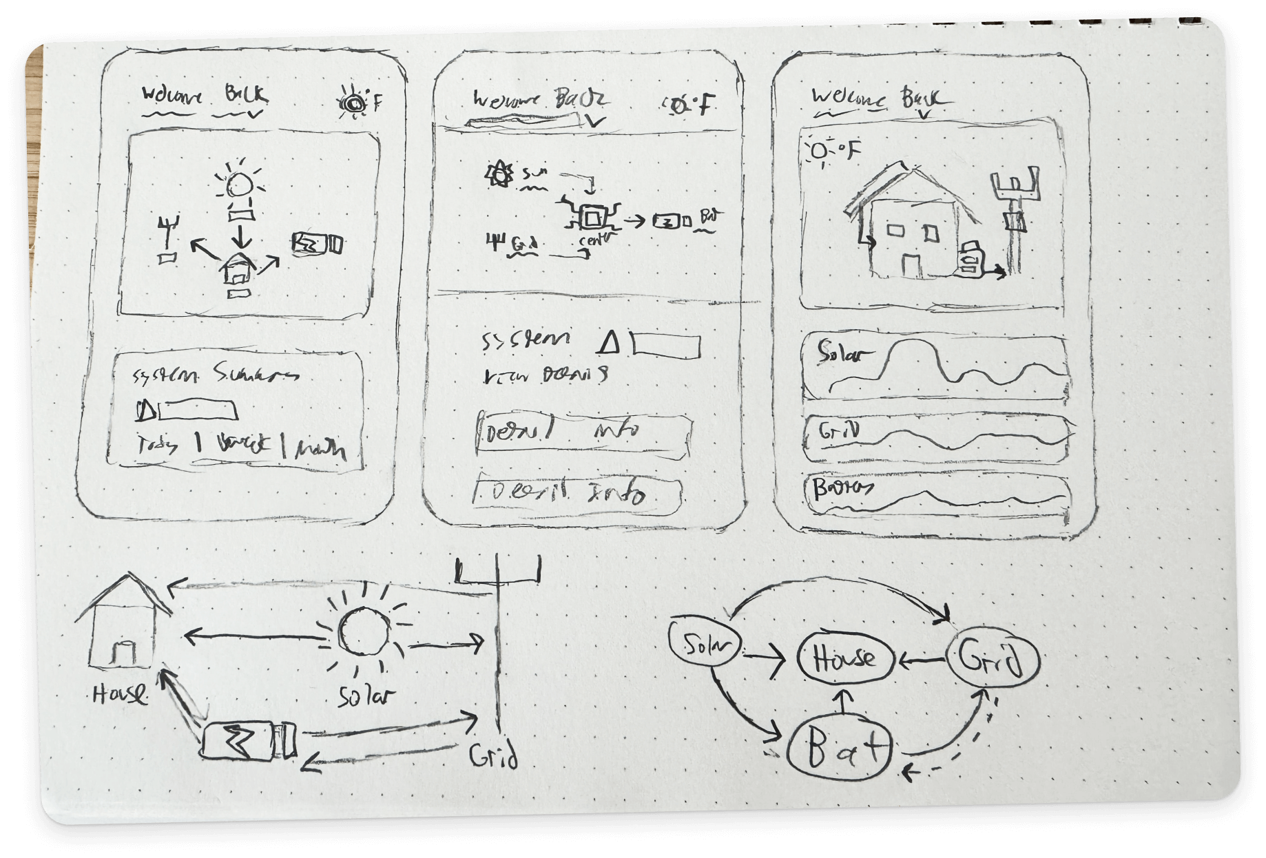
Initial Iterations
I started with lofi concepts. These were done in tandem with the visual language stage of the MyEverBright redesign.
This allowed me to get a head start on visualizing this feature while gaining valuable stakeholder feedback.
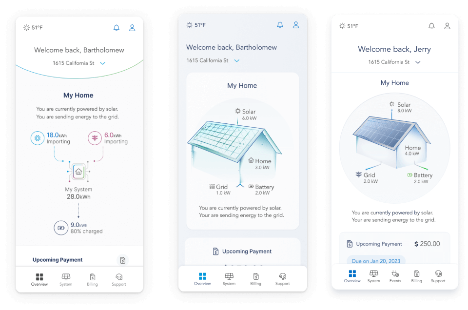
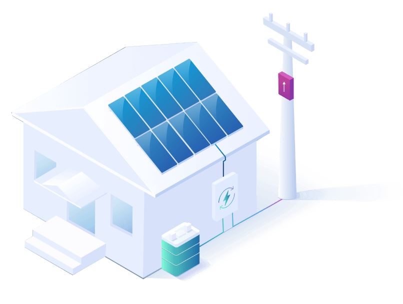
Picking Sustainable Graphics
MyEverBright needed a graphic direction that would effectively illustrate our real-time power flow feature, while also maintaining brand consistency.
Using stock vector assets I created several simple mockups and collaborated with stakeholders to find the right direction. Once a decision was reached I consolidated a library of pre-existing vector assets that I could easily customize
Final Graphic Direction
I chose an isometric style for the final direction. This was well liked by stakeholders and allowed me to create depth without the need for 3D rendering.
I also chose this direction because I had prior experience in illustration and could quickly customize and generate assets as needed.
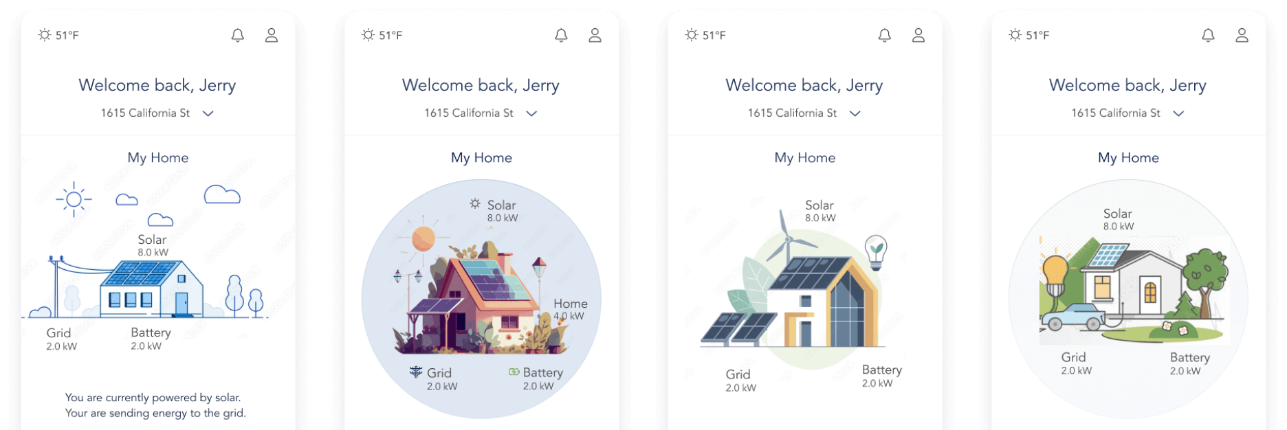
Early Iterations
With the final graphic direction defined, I went through several iterations of the real-time power flow feature.
I did a series of impromptu interviews and user tests to refine my design and ensure it was as easy to understand as possible.
Testing Techniques
Impromptu Interviews
I went through several rounds of impromptu tests with solar energy homeowners in my personal network.
This allowed me to refine the design as much as I could while negotiating with management for a testing budget.
Useberry User Test
I oversaw a series of unmoderated user studies via Useberry where users were asked to describe what they thought they saw and complete a series of tasks.
The test had a very high success rate and gave me valuable feedback on how I could improve my final iteration.
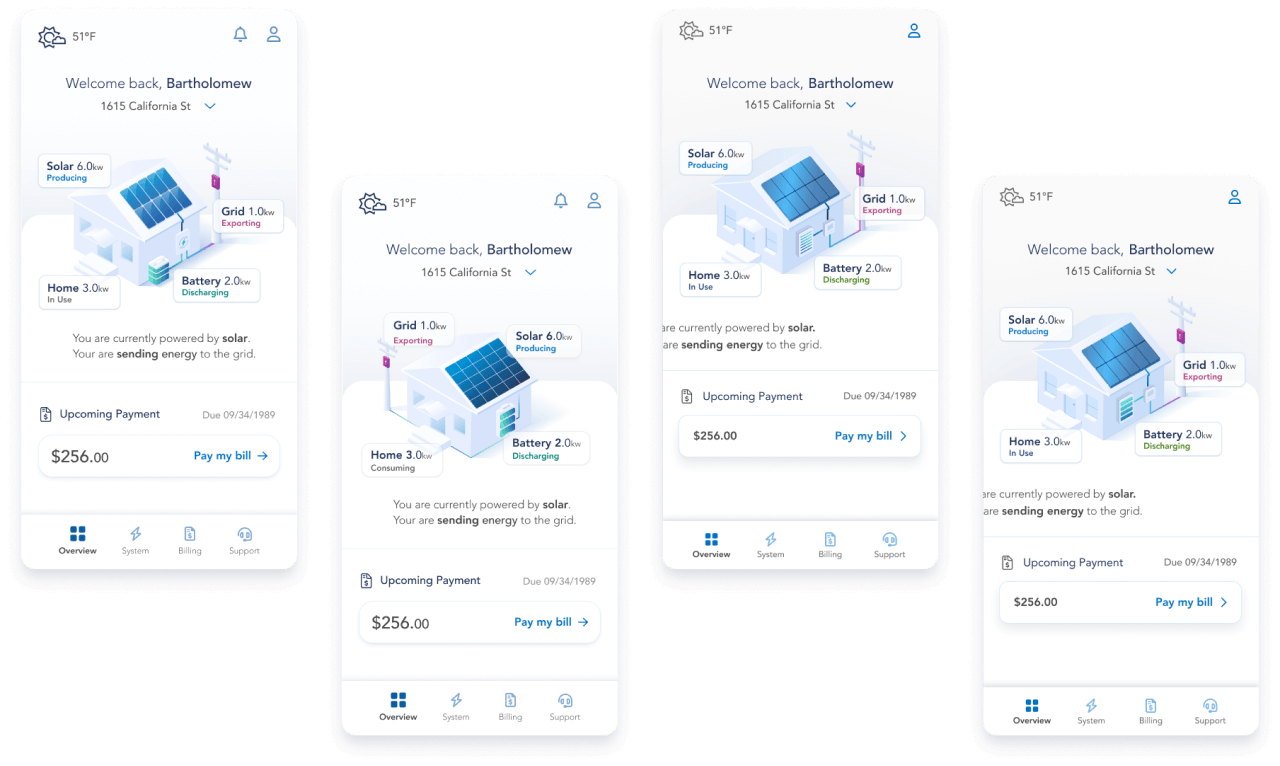
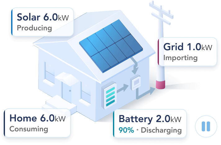
Final Iteration
Equipped with valuable user feedback and data, I created the final iteration of the real-time power flow feature.
Once finalized, I worked closely with our engineers to make the documentation needed to set them up for success.
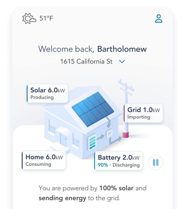
Key Features
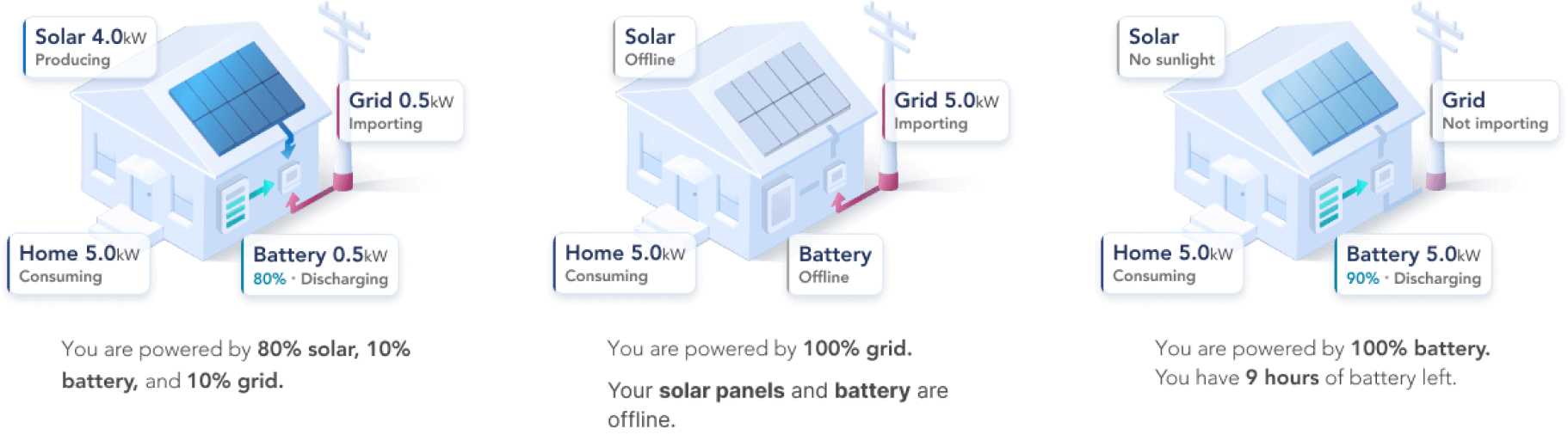
Animated Real-Time Data Flow
I optimized this feature as much as possible to ensure most users could understand their system state within 5 seconds.
Custom Animations
I created custom animations to match each possible use case and wrote thorough documentation on how to build them.
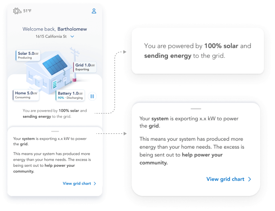
Multiple Ways of Comprehension
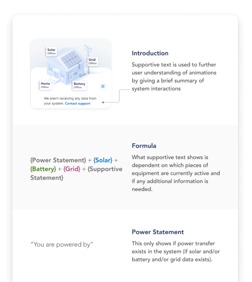
To make sure I was building a feature for all users, I created a dynamic written summary below the animated feature.
I also added an interactive drawer feature that gives users clear summaries of what each data point means.
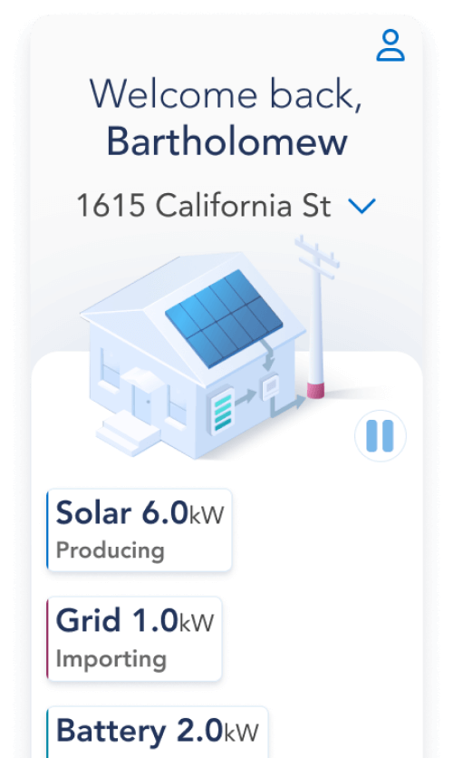
Accessibility Focused
I created an oversized text guideline to make sure this feature was both readable and usable with larger fonts.
I also ensured a pause button was included on launch so that users had control over the live animations.
All Possible Combinations
I made sure every possible scenario was accounted for and documented before launching the development cycle.
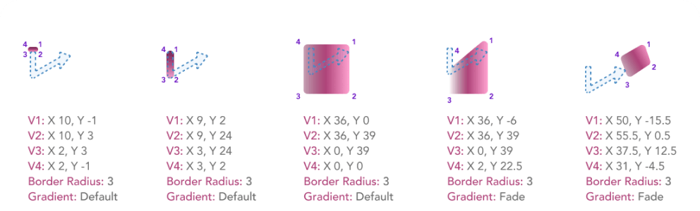
Documentation & Handoff
To help set our engineers up for success, I made our documentation as thorough as time allowed.
I included overviews, formula breakdowns, and annotated mockups for each element of the design.
Afterwards I met with the dev team at regular intervals to answer questions and give design feedback.
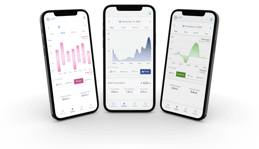
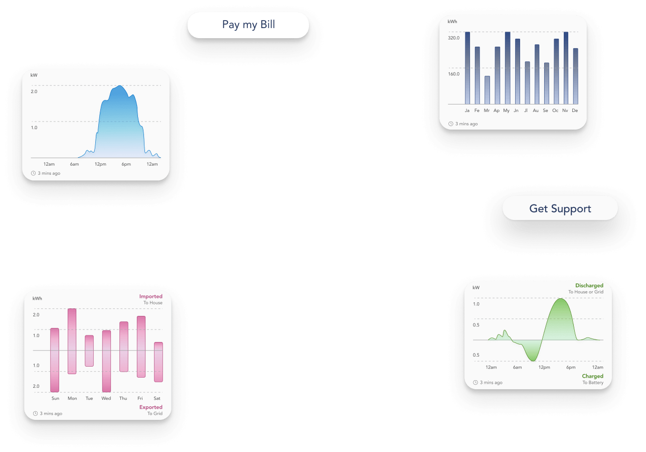
Application
With the designs for our most ambitious new feature complete, I was able to move on to the redesign of our data monitoring charts.